Empowering individuals to achieve their fitness goals through social connection, motivation and accountability.

This was my first solo venture into the world of UX & UI Design as part of my learning experience with Academy Xi. The idea for this app came from self-lived struggles with consistency in the gym and an array of fitness apps that I had tried which just weren’t right for me.
The intention was to create an app that would cater to a more experienced gym user, but research findings revealed that there was a greater need in the newly experienced gym user audience, as well as an apparent market gap for a social gym-based fitness app.
I worked on this project individually with the mentorship of a Senior UX Designer to take this from a problem statement through to a high fidelity prototype of the MVP.
Kicking off the formative research phase, I began by investigating leading competitors in the fitness app market in order to understand the competition, identify opportunities, and gain an edge.
No app had effectively integrated good social interactivity with gym-based workouts. Furthermore, the apps that did provide strong gym exercise tracking and progression lacked beginner friendliness and an intuitive user interface.


Next, I created an online survey to define the target demographic and identify exercise behaviours, motivations and barriers.
I learned that the target audience were aged 18 to 29 with a 60/40 majority to females. The results also confirmed that users struggled with motivation to exercise with more than half having used an app to track their progress.
Users needed motivation and reasons to encourage them to exercise.
Users needed extrinsic support and motivation to help them on their fitness journeys.
Users were unhappy with their progress but had no intent behind their training.
To elaborate, I conducted a series of face-to-face interviews with participants to identify user pain points, desires, and opportunities.
It became clear that a lack of motivation was caused by a lack of interest, progress, and guidance. It was also apparent that a strong support network would aid in bridging these gaps.
After collecting all of the survey and interview results, I took the time to create an affinity and empathy map to understand the user’s pain and gain points from their perspective.
To maximise my value for time in this project, I chose to prioritise clusters with the most insights in the affinity map which overlapped with the pain and gain points in the empathy map, namely social connection, workout guidance, and progress tracking.


I created two personas from the user research to represent the needs of the target audience.
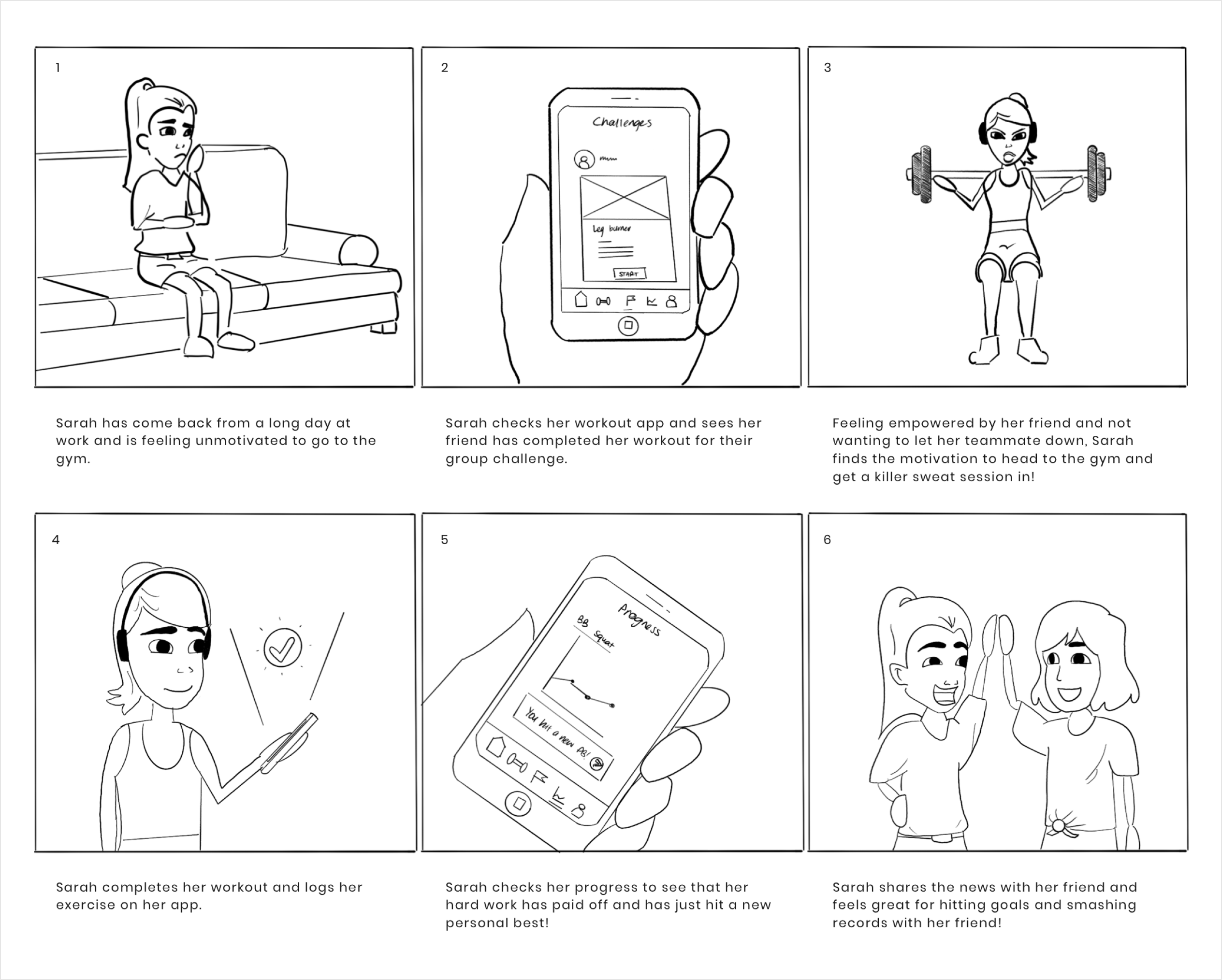
Sarah is a 26 year old woman who has experience in the gym. She enjoys being challenged by friends but finds herself training alone as its not practical to exercise regularly with friends.
Tom is a 28 year old man wanting to get fitter but is new to the gym and overwhelmed at where to begin. He is new to using fitness apps and programs but is willing to try. He loses motivation as a result of lack of progress.


Sarah and Tom had two very different user experience journeys.
Sarah would begin with motivation to embark on a fitness journey and run into some confusion picking an exercise program. She would regain her enthusiasm to begin her program but eventually lose interest in her routine.
Tom similarly was excited to begin his journey but was immediately overwhelmed by where to begin his exercise program. His experience would not improve as he would be unsure whether he was performing exercises correctly and would be disappointed with his results.


keep users satisfied with their progress so that they achieve their fitness goals?
simplify the UI so that logging workouts is less time consuming?
keep users interested in exercising so that they do not become bored?
connect our users with their friends so that they can support each other’s fitness journeys?
empower users new or unconfident in the gym?


In designing the information architecture, I was able to take liberty in grouping content and naming pages based on what had been seen throughout my competitors. With this I ended up with the user flow for the main functions of the app.

The wireframes were created based off the user flow diagram outlining the navigation and interaction between elements on each screen. I chose to move directly into digital wireframes to maximise my use of time in the project.

A reddish-orange was chosen for the Fittr brand due to its vibrancy, energy and friendliness that I wanted to associate with a fitness app centred around social connectedness. I paired this with neutral colours with blue undertones to balance the vibrance subtly with a complementary colour.
A page was taken out of the Material Design design system to create a responsive grid layout for mobile. I also adopted a 4-point grid system to keep vertical and horizontal rhythm consistent throughout the design.
A geometric sans serif font was chosen to give the brand softness whilst maintaining a modern and clean look to give the brand trustability. Heading and paragraph sizes were outlined to establish clear hierarchy to the content.
Primarily solid filled icons were used to be more recognisable when used at small sizes. The main exception was in the bottom navigation bar which used outlined icons to differentiate from the other app icons.


I experienced a few hiccups along the way. Two rounds of usability testing were conducted before finalising the MVP prototype. After the first round of testing, however, glaring flaws in the navigation and information architecture had surfaced requiring revisions to be made before proceeding.
Users expected the landing screen to be the Workout page because they believed it was the app's primary function. The old Home screen was thus renamed to Feed to give better understandability to the user.
Other issues arose on the Challenges and Workout pages, where users misunderstood what a Workout Challenge was and expected it to be on the Workout page. After renaming and rearranging the information architecture, a second iteration prototype was ready to resume testing.

The first prototype used a cooler red in an attempt to appear less intimidating in order to appeal to a wider audience. However, the results were polarising, with it appearing feminine and deterring male participants.
The brand colour was reconsidered, and the decision to go with a vibrant orange in the second iteration was well received by the next group of research participants.

The difficulty for new users began with choosing an appropriate exercise routine to fit their goals. Creating a fluid registration process that incorporated a workout questionnaire was thus a big opportunity as this would personalise their experience with the app.
Feedback was generally positive with the first iteration however the length of the questionnaire was cumbersome for some and users were put off certain questions. To amend this, I refined the questions asked and added the option to skip the questionnaire entirely, with the option to access it later from the Profile screen.
More problems arose on the Recommended Programs screen, where users became stuck because it was not obvious that the program card could 1) be clicked on and 2) needed to be selected to proceed. I redesigned the program cards for easy recognition, removed the "done" button, and added instructions to guide the user through the flow which smoothened the process.


The first version of the workout log included a player bar to allow users to progress through their exercises, rest, and sets in the style of a playlist. This approach, however, caused confusion among users because the player bar was unfamiliar in this context, and it also required users to complete the workout in the specified order, which was impractical. Furthermore, having a separate screen for the rest timer posed a problem because users weren't free to interact with their workout log.
The decision to forego both the player bar and the rest screen greatly improved the user flow. Users could now start their rest timer by pressing a button at the bottom of the screen which gave the user control to view their exercise history if need be. I also made room between the active and inactive sets to emphasise the working set, which improved data input.


The most friction occurred with accessing additional workout content. The original user flow had it organised within the Challenges screen, however, after the first round of testing it was clearly not a logical grouping. Instead, all users expected this to be in the Workouts screen.
Renaming and restructuring this content to the Workout screen in the second iteration proved to settle this issue in the next round of testing with all users successfully navigating to the correct location.


Changes were implemented based on the usability testing feedback to create the final iteration of the MVP. Below you can interact with the Figma prototype.
Guide: Blue squares indicate interactive components in the design. Press R to restart.
The final prototype addressed the issue of social connectivity and loss of interest through creating a platform for community, motivation and accountability. The learning curve for new users was also lessened allowing access to a wider audience and users were able to have their progress tracked objectively in ways other than just weight and appearance leading to higher rates of adherence.
Whilst the MVP was designed through to a high fidelity prototype, the project timeframe meant that time allocation in each design phase was limited. As a result, I was unable to undergo further rounds of usability testing to refine the app features and identify overlooked flaws. In hindsight, focusing on a smaller sample of opportunities in the first project phase would have allowed for a more thorough development and delivery design phase.


