Empowering Australian consumers with access and control over affordable, clean electricity.

I worked directly with iO Energy's COO as part of a team of 6 junior UX/UI designers and under the supervision of a senior UX/UI mentor.
At the time, iO Energy was a South Australian company looking to optimise the use of cheap renewable energy. They had yet to create their customer dashboard and were in the early planning stages of this now.
The client's objectives were to improve the utility of the customer dashboard and data display so that users could better understand their account data and optimise their energy consumption.
The first two weeks of the project were assigned to exploring and researching various methods of displaying data visualisation and identifying customer behaviours and motivations.
We conducted online surveys and in-person interviews with energy account holders to learn how they interacted with their dashboards and how they used energy. We asked questions like: What kinds of challenges do you face when managing your energy usage? What kinds of insights would make you feel more in control?
Users had stated they wanted to track their usage but was not reflected in real world practice.
Only a handful would monitor their usage. Users either found their insights confusing or had no incentive.
Users were motivated to track their energy consumption when there was a correlation with monetary savings.
We identified four competitors and four industry leaders outside the energy provider space to analyse their strengths, weaknesses, and opportunities to ensure we covered all bases.
The goal of this research would be to focus on the UI design choices, data visualisation, and features provided in order to guide our designs and set a standard to beat.

Using an open sorting method, we found that users cared most about their monetary expenses second to their environmental impact. There were also ample opportunities to be explored in dashboard features with an easy method to monitor their usage and the ability to compare periods being most prevalent.

Taking a human-centred perspective, we found that users were unconfident in their understanding of renewable energy but felt it was environmentally responsible. Furthermore, users rarely checked their usage on account of information being difficult to understand and current UI design being inaccessible.

We created a persona to encapsulate the iO Energy user we would be designing for from our formative research. The typical user was in their thirties, married and environmentally conscious. They engaged in energy saving behaviours to reduce their energy costs but rarely used their energy provider dashboard to keep things on track.

Following the customer’s journey, their experience was negative before even logging into their dashboard, with frustrations being expressed over a lack of notifications and alerts to check their usage. This was only consolidated with their confusion behind understanding their energy usage and bill breakdowns.
How might we give users the power of being in control of their energy and financial expenditure?
How might we make users feel empowered for choosing to use renewable energy?
How might we motivate users to check their energy usage more frequently?
How might we encourage users to reduce their energy usage and minimise their costs?
How might we present usage data in a way that is easy to interpret and understand?
How might we educate users on energy in an engaging manner?
With our how might we questions established, we dived into a brainstorming session to come up with rapid ideas we thought would solve the issues presented, then voted as team on which we thought most suitable for actually designing.

We kept to conventional naming of our tabs as seen throughout our competitor analysis to reduce confusion for new users. This allowed us to focus on improving the functionality of specific features within these screens.

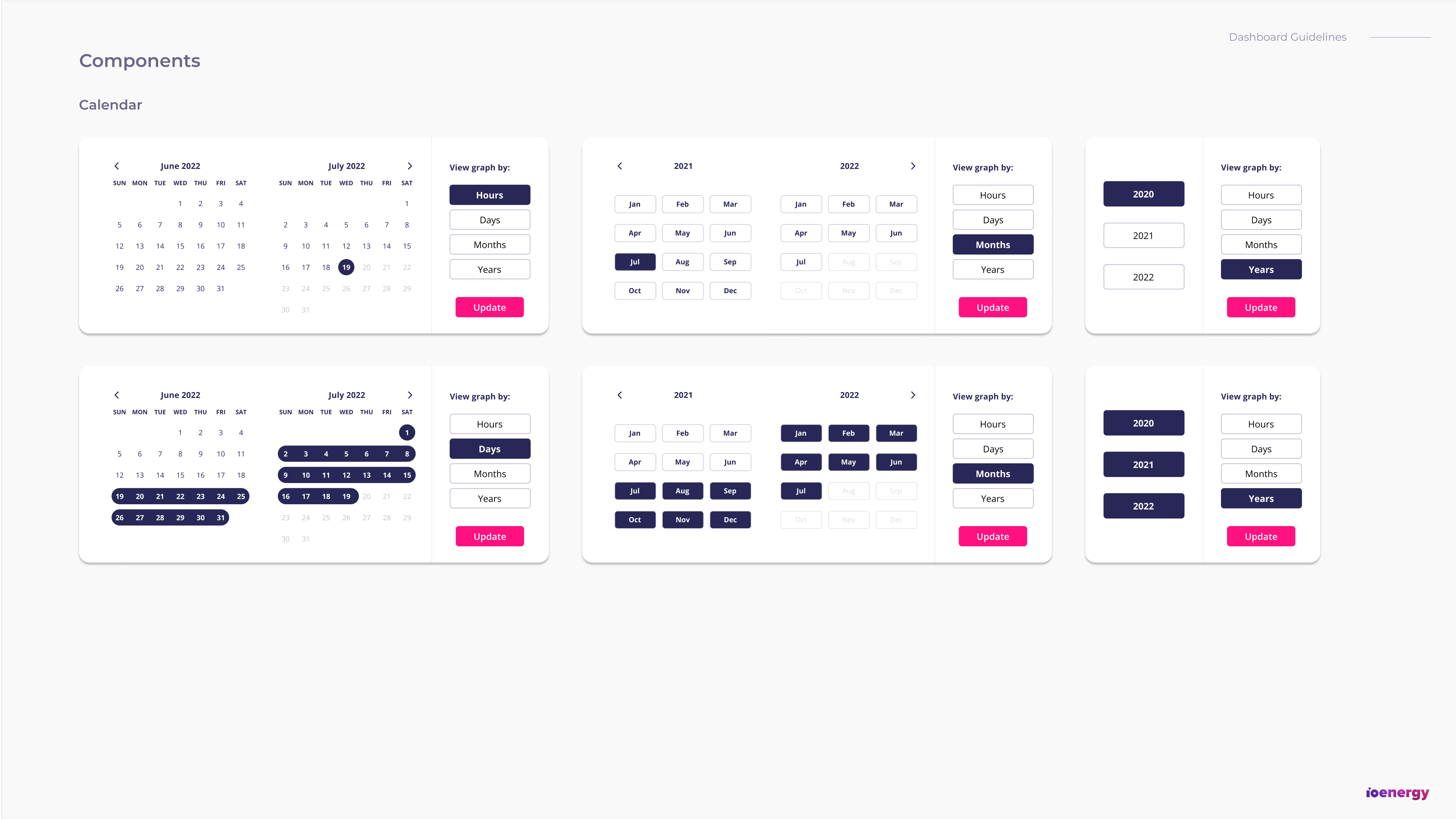
With the IA established, we created wireframes which we progressed into a low fidelity prototype to take into the next steps. Below are a few of the main screens from the prototype.

The existing purple, pink and fluorescent green colours were used to keep familiarity and consistency with the iO Energy brand. We also implemented system notification and status colours to give users clear positive, negative and warning feedback.
Material Design icons were utilised as they are simple, modern, friendly and sometimes quirky. Limiting icons to this library ensured iconography remained consistent through the dashboard. All icons were displayed at 24 x 24px but alternate sizing rules were established if needed to be used at a larger scale.
A second typeface was introduced to ensure effective legibility of the data on the dashboard. Open Sans was chosen as it allowed for excellent web and mobile readability and would transfer well in the future development of a mobile dashboard.
An existing illustration pack was used throughout the design to create visual interest on the screen and support the brand in appearing less intimidating especially in a content heavy dashboard.


We didn't succeed on the first try. Before releasing our final version to our stakeholders, we went through three rounds of usability testing for our core dashboard functions. Due to time constraints, we chose to begin testing with a mid-fidelity prototype and progress to high-fidelity in later rounds.
The My Usage screen in the initial version included two graphs, one for Energy Usage and the other for Usage Comparison, which created a problem with visual hierarchy. When asked to compare their usage, the majority of users completely ignored the second graph.
In the main graph, we added a compare button that would direct people to the appropriate graph on the page. Despite this, we discovered that having two separate graphs was ultimately too confusing, necessitating the usage of tabs within a single graph to allow users to switch between them. The comparison graph was easily found by all users in this iteration, which garnered favourable feedback.


The hierarchy of the bill notification was a source of contention in the first iteration of the dashboard screen, with some notable feedback indicating that a bill notification should be clearly visible upon logging in. To address this, we re-evaluated the visual hierarchy and ultimately decided to emphasise the Billing Reminder by placing it at the top of the page. This increased user satisfaction when users were asked to pay an overdue bill in the next round of testing.
Users were also confused by the Energy Price "clock," which they found difficult to understand. We implemented a bar to display the time linearly with a meter to indicate the cost efficacy which solved all confusion in the next round of testing.


While the colour scheme in the high fidelity prototype was not a concern raised by our usability testing participants, we discovered that an overly light UI deviated too far from the iO Energy brand identity. To test this, we created a purple and pink gradient using the iO Energy brand colours to apply to the side navigation bar to give the dashboard personality and recognisability.
We used an A/B test to validate our hypothesis in the final round of testing and discovered that all users preferred the gradient side navigation bar.


We applied adjustments to our design according to the results we gathered from our usability testing to end up on our final design for the prototype. Below you can interact with the Figma prototype.
Guide: Blue squares indicate interactive components in the design. Press R to restart.
The dashboard we created was very well received by our stakeholders. It was ultimately left in their hands to take to their internal team for further refinement and development for an MVP release.
Due to the scope of the project, there were several features that needed to be omitted. Some key opportunities like gamification of energy savings, a rewards program and dark UI variations were features that needed to be reserved for a second phase of the project and were recommended for consideration to increase user engagement.